Movies for Photographers Vol. 2 (Cinematography 1980s, 1990s)
Once I've borrowed projector from the friend ...^_^
I have selected more than 90 movies with the great Cinematography work that deserves attention of any visual Enthusiast. Here is the 2nd Volume of my List.
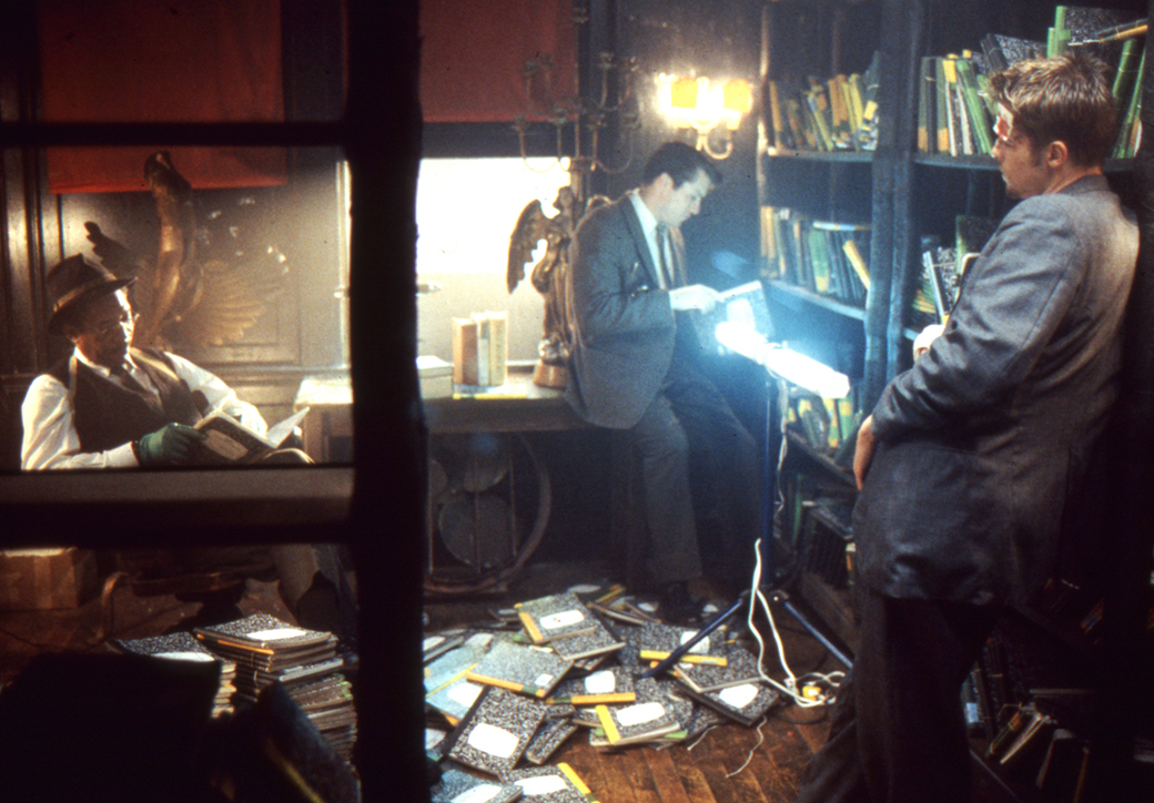
L.A. Confidential (1997) - Curtis Hanson
 - Curtis Hanson")
Cinematographer - Dante Spinotti
Timeless Neo-Noir film. With the psychology interplays and dark scenes.
I tried to compose shots as if I were using a still camera. I was constantly asking myself, ‘Where would I be if I was holding a Leica?’
– Dante Spinotti
Spinotti quickly understood Hanson wanted neither the traditional “nostalgic haze” frequently relied on upon films to suggest the period nor the clichéd smoke and diffusion of film-noir visuals so often used in urban crime stories. As Hanson eloquently put it, he wanted the “Light of Los Angeles.”
Hanson and Spinotti were influenced by Robert Frank's 1958 book The Americans, which resonates in almost every aspect of the film’s look, from practical lighting and camera angles to the selection of locations.
Departed from classic Noir, Spinotti took advantage of the city’s natural light and worked on interior locations with practical light, spiced it with the occasional appearance of menacing, reflections, exaggerated shadows and surrounding darkness.
I like to shoot dark images. I’m drawn to the mystery of darkness with brightness in the center; that's instinctive to me.
– Dante Spinotti
You May also Enjoy (cinematography by Dante Spinotti)
Se7en (1995) - David Fincher
Cinematographer - Darius Khondji
Iconic Dark rainy thriller with the spectacular light and bizarre details.
Shot on film with the special colour process. By pushing his stock by a stop, using a re-silvering process occasionally flashing, Khondji dramatically deepened the blacks and saturated the remaining colours.
“I saw these crimes as the work of an artist,” the cinematographer says, “like the work of German artist Joseph Beuys, who was the father of modern conceptual art. This serial killer will create scenes of murder with different lighting, decorations, words written on the walls or floor in blood — very weird. You are led into a world of images by the killer, suggested by the Seven Deadly Sins. That’s important to understand as you see the different lighting atmospheres in the movie.”
For Seven Khondji found inspiration while walking the nighttime streets of Manhattan.
The moisture, the colors, the water, everything felt right for the movie — even though it was to be made in Los Angeles, and I didn’t even know if I would be shooting it yet.
– Darius Khondji
Many Darius’s inspiration also came from The Americans book by Robert Frank.
One of the first books I brought with me was The Americans by Robert Frank,” says Khondji. “It became a bible for me. It’s all black-and-white, but the photos have the spirit of modernity. You feel the dynamic in Frank’s photography — which also helped me decide on the Primo lenses. The Panavision system is great, but I wanted the Primos which I knew would give me that same feeling. So we shot the movie on Primo lenses in Super 35.
– Darius Khondji
The neverending rain in the movie symbolizes the constant and overwhelming thought currents.
The darkness and the dull green-yellow colour palette with the high contrast create the mood of decay, roughness and angst. Whereas the deep reds and blacks symbolized the origin of darkness in the killer's house. The almost monochromatic reds with greens in the warehouse gave that a kind of Hamburg violent look.
Darius has used many practicals and some smoke to bring the natural look to the movie.
I love to see the origins of light within a shot, so source lighting is one of the main techniques we used.
– Darius Khondji
Khondji often puts the subject into the Darkness with backlight. Surrounded by the different layers for depth in back or for isolation in front. In his indoors scenes we see the interplay between the cold backlights and soft warm fill lights from the sides or from the top.
Then we would use Kino Flos as a backlight — a very soft line of light — and Chinese lanterns as top light, our key light. We used that combination often, with one and a half stops to two and a half stops difference between the key and fill.
– Darius Khondji
Darius also says that he was inspired from “The White Rose” by D.W Griffith where the outdoors were brightly lit and indoors had this moody feel where the source was simulated while being in the frame, like they were lit from a flame far away, just like a painting.
You May also Enjoy (cinematography by Jeff Cronenweth)
- Fight Club (1999) - David Fincher
- The Game (1997) - David Fincher
- The Social Network (2010) - David Fincher
- The Girl with the Dragon Tattoo (2011) - David Fincher
Fallen Angels (1995) - Kar-Wai Wong
 - Kar-Wai Wong")
Cinematographer - Christopher Doyle
Beutifully drunk cinematic aesthetic of alienation and longing in vivid colours.
The movie is full of Wong’s stylistic signatures like exaggerated neon-tinted lighting, the use of music grooves to underscore moods, and pixillated slow-motion action scenes.
I wanted to use Massive Attack’s music, but it was too expensive, so I asked my composer in Hong Kong to do something like Massive Attack.
– Wong Kar-Wai
Gracefully violating the classical storytelling rules movie tells two interlocking stories filled with digressions and jumps in time. Spiced with voiceovers it often emphasizes characters thoughts with narration.
In Chinese there is a term which is very difficult to translate into English, it is something like “chances.” It means: Why am I sitting here having this interview with you instead of somebody else? Why should we meet here? This is about chances, and I think all my films are about chances.
– Wong Kar-Wai
Having small timeframe after two years of working on Ashes of Time, Kar-Wai took on a low budget film Chungking Express to make himself feel comfortable about making films again. He was so enthusiastic that the Chungking Express was finished in 6 weeks and the third part of it would become Fallen Angels connected like the "night and day of Hong Kong".
To me Chungking Express and Fallen Angels are one film that should be three hours long.
– Wong Kar-Wai
Cinematography by Christopher Doyle is groundbreaking as always.
We fucked up with the film stock. It was old. We couldn’t re-shoot…so of course it was foggy in color. We said: “maybe this can represent something so let’s pick some other pieces,” and that’s what we did. Because of a mistake, a certain structure came out of the film and you can write a PhD about it if you want. What happened was that we gave it a system, so we made the most important parts of each scene in black-and-white. But that was a solution to the problem, not an original concept. We just appropriated the mistake and made it work. It’s a more intuitive, open, or, maybe, Asian way of working.
– Christopher Doyle
You May also Enjoy (cinematography by Christopher Doyle)
- Chungking Express (1994) - Kar-Wai Wong
- Days of Being Wild (1990) - Kar-Wai Wong
- Happy Together (1997) - Kar-Wai Wong
- In the Mood for Love (2000) - Kar-Wai Wong
- 2046 (2004) - Kar-Wai Wong
- Liberty Heights (1999) - Barry Levinson
- Hero (2002) - Yimou Zhang
Pulp Fiction (1994) - Quentin Tarantino
 - Quentin Tarantino")
Cinematographer - Andrzej Sekula
Classics. Stylish tribute to crime and pop-culture, rich with narrative and clever storytelling.
Most of us have seen Pulp Fiction as it is one of the definitive 90’s films and the film itself played a significant role in defining the 90’s with its trends.
[gun shooting is heard]
I’m sorry, did I break your concentration?
With the financial backing of Miramax producers Harvey and Bob Weinstein (as well as a continuing collaboration with RESERVOIR DOGS producer Lawrence Bender), PULP FICTION jumps leagues beyond Tarantino’s debut in terms of visual presentation. Retaining the services of cinematographer Andrzej Sekula, Tarantino opts to shoot on 35mm film in the anamorphic 2.35:1 aspect ratio. This makes for bold, frequently-wide compositions that highlight the characters amidst the dried-out San Fernando Valley landscape. Tarantino and Sekula cultivate a color palette that’s reminiscent of aged Technicolor—creamy highlights, slightly washed out primaries and slightly-muddled contrast. The result is a burnt-out rockabilly aesthetic that jives with Tarantino’s Elvis-inspired, anachronistic visual style.
[uncomfortable silence]
Why do we feel it’s necessary to yak about bullshit in order to be comfortable?
Andrzej Sekuła played around a lot with both conventional and unconventional framing and composition. He also ensures that he does not break the 180-degree system, crossing over the axis of action in the movie. This is so that the relative positions of the characters in the frame remain consistent and that we as the audience do not feel disorientated.
Any time of the day is a good time for pie.
Having increased budget Tarantino goes all-out with a dynamic camera that bobs and weaves as it follows its subjects with enthusiasm for long tracking shots.
The cherry on top was using an old filmmaking Rear projection technique from the days before green screen. Brilliant idea with black and white rear projection, while the actors were rendered in full colour added vintage flair to the film’s look.
It’s the little differences. I mean they got the same shit over there that they got here, but it’s just — it’s just there it’s a little different.
– Vincent Vega
The warm vintage sound oftentimes sourced from the vinyl itself with its hiss, cracks, and all perfectly complemented the use of various pop, rock and soul tracks.
I admire Tarantino’s signature razor-sharp wit, nonlinear timeline, long-drawn-out dialogues, quirks and sense of “movie-ness” — everything is believable, yet just a little larger than life.
For my two films my head cameraman, Andrzej Sekula, and I used 50 AMC film which has the slowest emulsion there is. It requires a huge amount of light, but it’s not the least bit grainy and the image is as clear as crystal. I’m happiest with the results in Pulp Fiction. The colors are so bright they jump right out at you!
– Quentin Tarantino
You May also Enjoy (cinematography by Andrzej Sekula)
- Reservoir Dogs (1992) - Quentin Tarantino
- Four Rooms (1995) - Quentin Tarantino
- American Psycho (2000) - Mary Harron
Schindler's List (1993) - Steven Spielberg
 - Steven Spielberg")
Cinematographer - Janusz Kaminski
Black and white masterpiece with the cherry on top.
Kaminski shot most of the film on black-and-white emulsion. The sequences with the little girl in the red coat were shot in color emulsion and then painstakingly desaturated in a process called rotoscoping, which Kaminski describes as “an old version of CGI, except each frame was done by hand.
But the true signature of Spielberg and Kaminski collaboration is heavy backlight to create tension and atmosphere.
You get criticism for that kind of lighting and you get prizes for that kind of lighting, Some people say, ‘Enough of this, move on,’ but I like it! Light is life, and for me, the presence of light is essential…. I love backlight not just for the sake of glamorizing [the subject], but because the direction of the light can represent storytelling. I don’t do backlights and then also add key lights and all these things — if I do backlight, I want to see that backlight. That’s my style, and that’s the way we’ve done it in every single movie.
– Janusz Kaminski
The composition with its various juxtapositions and layering is also exceptional in the movie. I can not miss the various use of windows and natural as well.
You work in metaphors through lights and composition, and the worst thing for me is to see a movie that doesn’t have that. You see a cinematographer’s work and there are no visual metaphors, or they are so afraid to create a style that it just becomes this nothing.
– Janusz Kaminski
You May also Enjoy (cinematography by Janusz Kaminski)
- The Diving Bell and the Butterfly (2007) - Julian Schnabel
- War Horse (2011) - Steven Spielberg
- Minority Report (2002) - Steven Spielberg
- Catch Me If You Can (2002) - Steven Spielberg
- Lincoln (2012) - Steven Spielberg
- Bridge of Spies (2015) - Steven Spielberg
- The Terminal (2004) - Steven Spielberg
- Jerry Maguire (1996) - Cameron Crowe
- Saving Private Ryan (1998) - Steven Spielberg
Barton Fink (1991) - Coen brothers
 - Coen brothers")
Cinematographer - Roger Deakins
Storyboarder - J. Todd Anderson
Assistant Editor - Michael Barenbaum
Comedic Noir film with a great visual style which splits and submerges the reality and imagination through the colour and composition.
It seemed important to us to create a feeling of isolation. Our strategy was to establish from the very beginning that the main character was experiencing a sense of dislocation.
– Joel Coen
It is one of the conventions of the classic crime film to lay out false trails as long as possible for the viewer. That said, our intention was to keep the ambiguity right to the end of the film.
– Joel Coen
...Barton Fink does not belong to any genre, but it does belong to a series, certainly one that Roman Polanski originated.
We used a lot of greens and yellows to suggest an aura of putrefaction.
– Etan Coen
You May also Enjoy (cinematography by Roger Deakins)
- Fargo (1996) - Joel Coen, Ethan Coen
- The Shawshank Redemption (1994) - Frank Darabont
- Sicario (2015) - Denis Villeneuve
- Skyfall (2012) - Sam Mendes
- True Grit (2010) - Ethan Coen, Joel Coen
- No Country for Old Men (2007) - Ethan Coen, Joel Coen
- The Reader (2008) - Stephen Daldry
Delicatessen (1991) - Jean-Pierre Jeunet
 - Jean-Pierre Jeunet")
Cinematographer - Darius Khondji
Absurd fairy-tale with the vivid colours, green tones and beautiful composition.
Shot on Film with a special colour process.
On the very technical side of any film, the most important thing to me is to control a stock’s contrast, or gamma curve,” Khondji explains. “I usually shoot on Kodak, and when you ask for 48 or 47, you get a certain latitude, a certain curve. So I like to change that curve according to the tone of the story, or even to play with it from scene to scene.
– Darius Khondji
To that end, he began using a non-bleaching process in his color work, leading to further experimentation with a silver process that called for his stock to be run first through color baths and then re-souped as black-and-white, restoring silver to the negative and resulting in rich blacks while simultaneously desaturating colors. Delicatessen was his first feature to benefit from this procedure. “The directors wanted very contrasty images — something that would put color into the world of realism poetique, a current of the French cinema of the 1930s and ’40s which was very expressionistic,” Khondji remembers. “So I had to increase the contrast beyond what I could get from lighting.” As the blacks were so deepened by the silver process, Khondji would first use the Arriflex VariCon system to add detail in the shadows, while at the same time pushing the negative a stop to saturate the remaining colors as much as possible. “We put more color back in at every step we could, while at the same time getting these strong blacks — like ink,” he says.
Also, for the first time I used Chinese lanterns on a feature, – he adds.
When I was a child I had a huge paper lantern in my bedroom, which I loved. So I asked the gaffer on Delicatessen to find us some, which we used on dimmers. I thought I had invented something until someone said to me, "Interesting that you use the same techniques as Phillipe Rousselot!" I knew I hadn’t invested anything else, but I thought for sure the lanterns were mine!
– Darius Khondji
You May also Enjoy (cinematography by Darius Khondji)
- Se7en (1995) - David Fincher
- The City of Lost Children (1995) - Jean-Pierre Jeunet
- Stealing Beauty (1996) - Bernardo Bertolucci
- Midnight in Paris (2011) - Woody Allen
Nuovo Cinema Paradiso (1988) - Giuseppe Tornatore
 - Giuseppe Tornatore")
Cinematographer - Blasco Giurato
Music Composer - Ennio Morricone
Poetic movie about the power of dreams and Love to Cinematography.
Few films in history have articulated so simply and so poetically what it’s like to have a love affair with the movies.
From the age of about 7 to 26, I would see at least one movie per day in a theater. That was a time when you could see a new film by a master like Fellini, a giallo by someone like Dario Argento, or a B-movie exploitation piece of shit, but I learned something from them all.
‘See everything!’ If you just see the sort of movies that you think you will like, your sensibility will be very narrow.
– Giuseppe Tornatore
After the closing of one of the oldest theatres where Giuseppe Tornatore was being involved in as the projectionist, he always wanted to take that atmosphere and put it into a story. During the next ten years, Tornatore made notes on it and interviewed many of the old projectionists for their stories, then he wrote the script.
After I finished my first film, my producer said to me “Don’t you have a passion project? Something you’re dying to make?” And I told him the entire story of Cinema Paradiso, right there. He was so touched that I decided to make it as my second movie.
– Giuseppe Tornatore
When I talk about cinematography of Giuseppe Tornatore I do have to mention any technical sides. To me, his signature is to show the poetic side of Dreaming. Through his bright imagination and clever visual storytelling complemented by sensitive music of Ennio Morricone, you could dive deep into those dreams.
When I wrote the story, when I made the movie, I wasn’t thinking of fame and fortune. The movie is not the product of a calculation. It was the result of a feeling and discover after so many years that so many people have been touched by it, telling me as you did that they were Toto.
I like to say that the world is populated by a big crowd of little Totos, and that’s great. I love it.
– Giuseppe Tornatore
You May also Enjoy (movies by Giuseppe Tornatore)
- La leggenda del pianista sull'oceano (1990) - Giuseppe Tornatore
- Stanno tutti bene (1990) - Giuseppe Tornatore
- Una pura formalità (1994) - Giuseppe Tornatore
- Malèna (2000) - Giuseppe Tornatore
Rain Man (1988) - Barry Levinson
 - Barry Levinson")
Cinematographer - John Seale
It's all about characters, the transformation of one due autism of another.
Barry Levinson came on board after three previous directors resigned off on this movie. (Nobody could quite get a handle on it, make a personal connection).
If I can show the autism for what it is and understand it – show the frustration and the humor – if I can make the relationship work with these two guys on the road, then that’s enough for me.
– Barry Levinson
Imho, Rain Man is a unique movie in terms of the point of view of characters. Their limitations, acceptance and transformation.
Someone once said to me, “Well, write an outline for the thing.” I said, “I can’t.” I’d be writing an outline until I die. If I’d tried an outline for Diner, I’d never have finished. Get me to the character. When I get to the character, then it makes sense to me. Then I know where it’s going, and then it all opens up.
– Barry Levinson
John Seale on shooting spherical or anamorphic format.
Spherical (1:85) to me has always been more of a people format, whereas anamorphic is more of a scenic format.
– John Seale
You May also Enjoy (cinematography by John Seale)
- The Talented Mr. Ripley (1999) - Anthony Minghella
- The English Patient (1996) - Anthony Minghella
- Dead Poets Society (1989) - Peter Weir
- Witness (1985) - Peter Weir
- Cold Mountain (2003) - Anthony Minghella
- Mad Max: Fury Road (2015) - George Miller
Time of the Gypsies (1988) - Emir Kusturica
 - Emir Kusturica")
Cinematographer - Vilko Filac
Mythical, compositional, colour, music and absurd paradise.
The Gypsies of my film survive like insects, according to the principle of the natural selection, according to the beauty of the colours and the shapes of the wings.
– Emir Kusturica
Kusturica keeps the animals as an essential part of his film language and frequently points at the Magical Realism connections in the incredible architecture built in his scenes.
In Gypsy mythology, geese are the animals who flew the Gypsies over the ocean and into Europe, which I think is beautiful. Geese are so elegant and somehow so intelligent that between one and many geese there is incredible harmony, plus they bring a great dynamic to a scene. It's also like a color you need to bring to a painting from time to time - my movies are not just based on the commercial need to tell a story. I like repeating those kinds of colors or motifs because they please me
– Emir Kusturica
The movie full of rhetoric meaning and symbolism, exposing many negative social aspects of Roma lives with satire and absurd.
Hopefully, in my films you get excited by every character you meet, as you do in Fellini's
– Emir Kusturica
Long opening shots and beautiful Roma music gives your soul the time to be drawn into an atmosphere completely. Kusturica's camera is constantly moving at a slow pace, sliding from one compositional frame to another as the scene progresses.
"My life is an utopy"
What I like the most, it is how organically Kusturica portrays the whole Roma community. Their freedom, the way they accepted life, their direct connection to joy, and their strength and optimism without hiding the bad side of the golden coin. Kusturica is a wanderer himself, just like the fairytale-gypsies in his films.
I am a man without a country, travelling between Paris and New York and Belgrade and Montenegro. My roots are in Herzegovina, but I don’t care about nationality. I care about higher values in human life.
– Emir Kusturica
You May also Enjoy (cinematography by Vilko Filac)
The Last Emperor (1987) - Bernardo Bertolucci
 - Bernardo Bertolucci")
Cinematographer - Vittorio Storaro
Distinctive composition, colours and light. Spectacular atmospheric environmental shots with emotion and history.
Storato uses not only different lights and hues to emphasize the mood but also plays with colour of objects in scenes using what in literature is called anaphora, a repetition of the same colour, in this case, to emphasize a concept.
Don’t forget that Leonardo da Vinci was calling 2 different elements: light and shadows. The marriage between them are creating children. The children are the color. That put it very nicely, but practically if you noticed the color coming from the blackness, and only when the primary element of black is activated creating red, orange, yellow, green, indigo, violet, and all together as Isaac Newton is teaching to us creating white light. So, this is a kind of verbal language, so you have to work like a writer is using words to transfer emotions, like a musician using notes, we using the knowledge of light and shadows and colors, and we can transfer emotions that way. Today, you don’t have to be only a technician, you have to be knowledgeable about the meaning of the visual art, you have to know the symbology, dramaturgy, and physiology. Everything is written in the writing with light. In light, in color, in elements.
– Vittorio Storaro
At each defining stage of The Last Emperor, a different colour dominates.
We see greys at the beginning as preparation for the new journey, the waiting.
In early shots of Pu Yi’s blood seeping into water, red defines his origins as a symbol of death and rebirth.
At the Emperor age between 5 and 8 years, orange becomes prominent. During the “orange period,” Storaro expresses Pu Yi’s internal state through light: for instance, there is no direct light on the emperor in the orange sequences because he had not yet emerged from the shadows to assume his identity. The orange defined the warmth and his connection with the family.
As Pu Yi becomes more conscious of his surroundings and becomes Emperor, the palette shifts to yellow. The colour of puberty, it's intuition and awareness which symbolizes the sun, the divine and its presence.
As the Emperor acknowledge the existence in the dull chromatic world of Forbidden City, colour expands as he acquires knowledge. Emphasized with green not only in tones but in objects itself (such as Pu Yi’s bicycle). It represents the flourishes of Life that starts again and knowledge that takes us to freedom.
The scenes and tones change to blue as the Emperor leaves the Forbidden City. Symbolizing the perspicacity of thinking, the freedom of intellect.
Within the context of red as the past and green as the present, blue became the colour of the future.
Around the age of 50 when Pu Yi realizes he wants to be an Emperor Again. We observe indigo. It represents full maturity, material power, the achievement of a level of Life.
After the grey years in communists prison, Pu Yi starts to accept his responsibility and the tones progress to violet; the full balance between passion and reason, the diffusion of knowledge, which represents the cyclic nature of life.
At the last years of Pu Yi's Life we the pure white. The sum of all colours, all phases, completeness of all feelings and passions.
There's one more colour which is always present: black. It is the matter, the beginning and the end, the presence and the absence of something and, of course, the unconscious.
You May also Enjoy (cinematography by Vittorio Storaro)
- Dick Tracy (1990) - Warren Beatty
- The Sheltering Sky (1990) - Bernardo Bertolucci
- Reds (1981) - Warren Beatty
- Apocalypse Now (1979) - Francis Ford Coppola
- Tango (1998) - Carlos Saura
- Cafe Society (2016) - Woody Allen
Paris, Texas (1984) - Wim Wenders
 - Wim Wenders")
Cinematographer - Robby Müller
Screenplay - Sam Shepard & Wim Wenders.
Music - Ry Cooder
Poetic movie that leans on Subtlety and the Inner World of its heroes.
Extraordinary beauty with Vivid Colours and Strong Composition.
We chose Harry Dean because he is one of the few adults I know who has kept the child that’s dead in most adults with him. He has an innocence about him.
– Wim Wenders
We tried to arrange the film in such a way that all sizes and types of American towns appear in it.
– Wim Wenders
I’d planned a real zigzag route all over America. But my scriptwriter, Sam Shepard, persuaded me not to. He said: ‘Don’t bother with all that zigzagging. You can find the whole of America in the one state of Texas.’
– Wim Wenders
Robby Muller's frequent use of magic hour sunsets, neon-lit barrooms, and street lamps that illuminate landscapes and people in phantasmagorical colours bring the contrasts and magical atmosphere, giving to each hero its own character in terms of Light and Colour.
It’s better if you know the ‘substance’ well and know were your general priorities are — Robbie Müller
Wenders makes you think this is what some character is seeing and all of a sudden it’s what you're are seeing.
Most of my films are exclusively designed from somebody’s point-of-view.
– Wim Wenders
You May also Enjoy (cinematography by Robby Müller)
Blue Velvet (1986) - David Lynch
 - David Lynch")
Cinematographer - Frederick Elmes
Emotional and voyeuristic landmark with suspense and aesthetic of violence.
Lynch's dark visuals are infused with a peculiar beauty and humour. His evocative style could be described as “A dream of dark and troubling things.”
The whole idea of the film is going underneath the surface of a supposedly peaceful neighborhood in a small American town...
– David Lynch
Lynch delves deeper into the sensual textures of decay. Therefore the movie full of metaphorical details and close up stills. Like the fence with roses with the look from the down, like a childhood picture; or insects in a suburban lawn, etc.
David loves to go through things,” Elmes says, “and I find that fascinating. I don’t think I could ever compete with David because his imagination goes that way.
– Frederick Elmes
David employed film noir dark scenes into the middle of the movie, whereas the beginning and the end looked more cheerful.
We had always planned to have the beginning and the end look like this very cheerful — slightly too cheerful — a little-bit-more-than-real world that David wanted to create
– Frederick Elmes
Yet for the night scenes, there were no lights on the selected street, so the team added the light sources to get the feeling that there really are street lamps up in the trees.
We’d taken a vision of what the street should look like and executed it correctly, and the street lights became most of my light for those shots. Also, it gave us the ability to have a real street light that was up to proper exposure and tow a car underneath it for a dialogue scene that took place in the car.
– Frederick Elmes
I really like how creatively the hell ride kinda scene was created. The car was staying still and they moved light sources fast outside, conveying that the car is riding on high speed.
That sequence was all done with the camera hand held and the car standing still while bouncing up and down as a lot of people worked lights that moved past very quickly. It was all choreographed in such a way that we gave the feeling that they’re out on the road.
– Frederick Elmes
Another distinguishable example of Elmes practical creativity was Ben's club scene with the horror of claustrophobic feeling spiced with a humorous look of oddly amusing characters.
Depressing isn’t the word really, but it’s certainly not a normal situation, it’s a very unreal situation. We originally planned some complex blocking and some complex shots in the scene and realized after rehearsing it thoroughly on location that all you did was complicate it. In fact, what played very well was having the characters in one wide shot. You saw clearly what was happening, and they did it so well, that it took something away to clutter it with a camera move or to try to do something tricky with the lighting. There’s a kind of awkwardness that is intentional. I think that it’s meant to put everyone on the edge of their seat a bit.
– Frederick Elmes
The main set (Dorothy’s apartment) was quite fabulous and styled after the era by production designer Patty Norris. The palette of colours was very well chosen and set a real mood for the things that happen. Space was lit in such a way as to distinct the places from each other as much as possible in terms of mood.
It was quite a wonderful set and the detail was all there, it was functional, the bathroom worked!
– Frederick Elmes
The scene in the closet deserves special notice. Elmes and Lynch created a striking lighting effect by illuminating Jeffrey's face through the slots of the closet doors, which very well emphasized an element of his voyeurism.
We never shot anything that he couldn’t actually see from the closet. The set was designed in such a way that the closet was in a special spot where Jeffrey can see the living room, he can see down the hall to the bathroom, and he can see part of the kitchen, but he can’t see around the corner which is the place Dorothy sneaks up on him with a knife.
– Frederick Elmes
Blue Velvet soundtrack grew naturally from the film’s scenes. The subtly sound design by Alan Splett makes you drawn into the powerful mood of the film.
The material dictates the mood and it also dictates the sound, – he explains.
We tried to get the sounds that make the right mood and it’s so simple, it’s so logical. The rest is just train and error in the blending of those things, and it has to be just right, but you know when it is and you know when it isn’t.
– David Lynch
You May also Enjoy (cinematography by Frederick Elmes)
- Wild at Heart (1990) - David Lynch
- Night on Earth (1991) - Jim Jarmusch
- Paterson (2016) - Jim Jarmusch
Blade Runner (1982) - Ridley Scott
 - Ridley Scott")
Cinematographer - Jordan Cronenweth
Dystopian noir movie with the Cyberpunk look metaphorical narrative
and unique lighting.
Ridley Scott wanted it to be the character-driven story. So he gave to actors the freedom to change things up based on how they were interpreting the characters.
Rutger Hauer came up with the “tears in the rain” line the speech’s final, which became one of the most poetic lines in his career and in cinematography.
All those moments will be lost in time, like tears in rain
– Rutger Hauer
We could feel the the mechanical-spiritual decay right from the opening shot: the perpetual nightscape of Los Angeles in 2019, the smog turned to black, the fallout turned to rain, the smokestacks blasting fireballs that look downright medieval against a backdrop of obsidian blight - VARIETY.
’Blade Runner’ changed the way the world looks and how we look at the world
– William Gibson (science fiction author)
Ridley Scott with the team created the groundbreaking visual look convaying the atmosphere and world of Cyberpunk and futuristic Los Angeles.
We used contrast, backlight, smoke, rain and lightning to give the film its personality and moods. The streets were depicted as terribly overcrowded, giving the audience a future time-frame to relate to. We had street scenes just packed with people. . . like ants. So we made them appear like ants — all the same. They were all the same in the sense that they were all part of the flow. It was like going in circles- like going nowhere. Photographically, we kept them rather colorless.
– Jordan Cronenweth (ASC, Mar 1999)
Naturally, to achieve that nostalgic cyberpunk look the set designs employed the heavy use of neon lights- lights like the ones in nighttime Tokyo. Jordan Cronenweth embraced the usage the untraditional shaft lighting and smoke that light was shown off with. Xenon lights (at the time more closely associated with large boats) became a key lighting source on a major Hollywood movie for the first time, which came to signify the futuristic look in many movies since then.
We used it over and over again in different applications. One way we justified their constant presence was to invent airships floating through the night with enormously powerful beams emerging from their undersides. In the futuristic environment, they bathe the city in constantly swinging lights. They were supposedly used for both advertising and crime control, much the way a prison is monitored by moving search lights. The shafts of light represent the invasion of privacy by a supervising force; a form of control. You are never sure who it is, but even in the darkened seclusion of your home, unless you pull your shades down, you are going to be disturbed at one time or another.
– Jordan Cronenweth (ASC, Mar 1999)
Ridley Scott’s vision, craft and use of special effects have passed the test of time and still remain equally captivating and magical despite of the critics.
...I never, ever read press again. Even if it’s glowing, best not read it, because you think you own the world. If it’s killer, best not read it because you think you’ve failed. You have to be your own critic.
— Ridley Scott
The Shining (1980) - Stanley Kubrick
 - Stanley Kubrick")
Cinematographer - John Alcott
Unconventional classics of the horror movies. Creepy masterpiece based on Stephen King’s novel.
Tailor-made psychologically bizzare movie. Kubrick says the vast amount of it based on non-verbal supernatural communication and signs. The movie is full of little subtle points that at least subconsciously give you awareness of what must have happened.
"I ... found that thinking of shots, or thinking of the way to shoot a scene before you’ve actually rehearsed it and got it to the point where something is actually happening that is worth putting on film, will frequently prevent you from really getting into the deepest possible result of the scene."
– Stanley Kubrick
Kubrick is also famous for his deep, almost obsessive researches on every topic he works.
"in this film, the art director, Roy Walker, went for a month all over America photographing hotels, apartments, things that could be used for reference. We must have photographed hundreds of places. Then, based on the photographs we liked, the draughtsmen drew up the working drawings from the photos, but keeping the scale exactly as it was, exactly what was there, not something like it"
– Stanley Kubrick
Stanley Kubrick 11-minute interview on The Shining worth more than all written reviews on it.
in working with him (Kubrick) there is always a different outlook, a different idea: “Let’s try something different. Is there any way we can do it differently? Is there any way we can make it much better than it was before?"
– John Alcott
P.S. Great movie evening at Home might be much better than spending the time and money for some mediocre film in Cinema.
When you would watch the movie by this recommendation and Enjoy it,
I would appreciate any contribution, which will help me to cover the website costs or just to buy a Glass of Wine for the next movie evening
Bonus (^_^)
- Raging Bull (1980) - Martin Scorsese
- Blood Simple (1984) - Coen brothers
- Taxi Blues (1990) - Pavel Lungin
- Bugsy (1991) - Barry Levinson
- After Hours (1985) - Martin Scorsese
- Down by Law (1986) - Jim Jarmusch
- Black Cat, White Cat (1998) - Emir Kusturica
- Dreams (1990) - Akira Kurosawa
- Armageddon (1998) - Michael Bay
- Eyes Wide Shut (1999) - Stanley Kubrick
VOLUME 1 (Cinematography 2000s, 2010s)
 - David Lynch")
See Also
- "Barton Fink": The Coen Brothers’ Meta Way of Dealing With Writer’s Block
- Emir Kusturica Interview by Graham Fuller, September 1999
- Wrap Shot: L.A. Confidential
- Flashback: Seven
- Wong Kar-wai by Han Ong
- The Directors series - Quentin Tarantino’s “Pulp Fiction” (1994)
- Giuseppe Tornatore Remembers as Cinema Paradiso Turns 25
- RollingStone - Barry Levinson on the Making of ‘Rain Man’
- The psychology of colour in cinematography. A study of The Last Emperor
- Global Cinematography - Interview with Vittorio Storaro
- IndieWire - Rutger Hauer Rewrote His Iconic ‘Blade Runner’ Monologue...
- ascmag - Flashback: The Shining